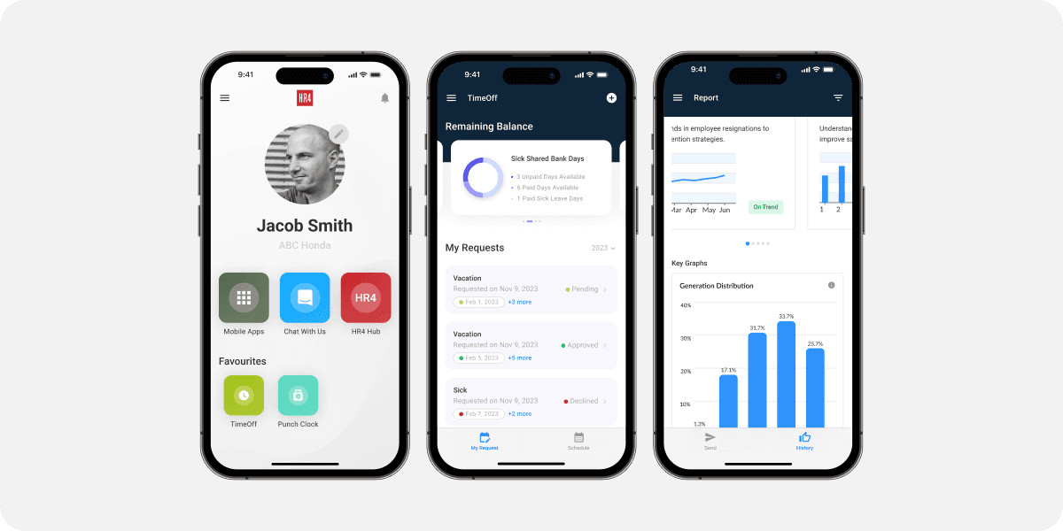
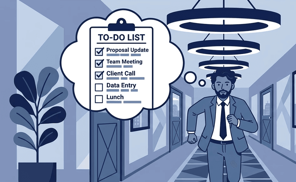
Most HR systems are designed for desks.
But many workers don't have one.
Challenge
Most workforce management tools are built for desktop use, making them inaccessible to frontline employees who spend their shifts away from a computer.
As a result, essential tasks—like checking schedules or requesting time off—are often delayed, creating friction and increasing the risk of missed actions.
Solution
Extend the existing workforce management system to mobile, enabling employees to access and complete key tasks anytime, anywhere.
The experience must be fast, intuitive, and reliable—so users can quickly act in the moment without disrupting their workflow.
My Role
UX Lead - Research, interviews, wireframing, interaction design, user testing, QA
Deliveries
Design System
Component Libraries
User Interviews
High Fidelity Designs
Team
1 Designer
4 Developers
2 Product Managers
Timeline
12 months
→ Research
→ Design system
→ Core mobile architecture
→ High-fidelity design
→ Development & QA
→ Launch
→ Iteration

A design system was created to ensure consistency across the product.
Colors and spacing were carefully defined to convey a sense of trust, clarity, and ease of use for HR software users.
Kickoff
Key Considerations
To guide early decisions, I focused on three key areas:

Feasibility
Ensuring existing desktop features could be effectively adapted to mobile without compromising performance or development efficiency.

Usability
Designing an experience that is intuitive, context-aware, and genuinely helpful for users in fast-paced, on-the-go environments.

Consistency
Maintaining a coherent experience across platforms while ensuring mobile interactions remain as effective as desktop.
Research
Client Interview
I conducted online interviews and on-site conversations with automotive dealership clients.
Key Problems
Frontline employees lack real-time access to HR tools
Time tracking relies heavily on memory and manual actions
Managers have limited visibility into daily workforce activity
What We Learned
Employees often forget to clock in when busy or away from a desk
Desktop-first systems don’t align with mobile work environments
Reduced in-person interaction increases reliance on digital tracking
Convenience directly impacts whether tasks are completed on time
Research
Design Implications
Employees often forget to clock in when busy or away from a desk
Desktop-first systems don’t align with mobile work environments
Reduced in-person interaction increases reliance on digital tracking
Convenience directly impacts whether tasks are completed on time
How might we enable frontline employees to complete time-sensitive HR tasks in the moment, without relying on memory or interrupting their workflow?
This question guided all key design decisions, focusing on speed, accessibility, and real-time interaction.
Research
Hypothesis
We formed the following hypotheses to validate key design directions:
If time tracking is supported by real-time, contextual prompts, employees will be less likely to miss clock-ins, improving data accuracy and reducing manual corrections.
If workforce management tasks are easily accessible on mobile, employees will be more likely to complete them during their shifts, increasing engagement and real-time usage.
If time tracking interactions are simple and low-friction, managers will have greater trust in the data, enabling more effective remote oversight.
Research
UX Strategy
To support real-time, on-the-go interactions, the design focused on three key principles:
Action Over Information
Prioritize actions users need to take in the moment, rather than overwhelming them with excessive information.
Mobile-Friendly Interactions
Design for quick, lightweight interactions recognizing that mobile users are unlikely to complete complex tasks.
End-to-End Self-Service
Enable employees to complete tasks independently, reducing reliance on in-person interactions or manual processes.
DEVELOP
Design Concepts
To address the key challenges identified earlier, I focused on simplifying access, supporting real-time actions, and improving visibility for both employees and managers.
Quick Actions — frequently used tasks are always one tap away
Contextual Feedback — users see relevant information at the moment they need it
Progressive Disclosure — complex information is revealed only when necessary


Track Time & Build Trust
Enabling accurate time tracking and transparent work history
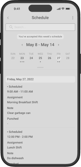
Stay on Top of Daily Tasks
Helping employees understand what needs to be done, and when.
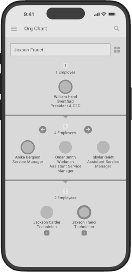
Improve Team Awareness
Making organizational structure and communication more visible and accessible.
Improve Team Awareness
Providing easy access to company information and performance data.
DESIGN
Final Design Direction
The final designs focus on enabling fast, in-the-moment interactions for frontline employees.
Key features were prioritized based on real user needs, ensuring critical tasks are always accessible, intuitive, and reliable in a mobile context.
Focus: Speed, visibility, and minimal friction

Instant Time Tracking
Clock in and out in seconds with real-time visibility into work hours.

Team Visibility
Quickly understand team structure, roles, and reporting relationships.

Quick Access Hub
All essential tools are accessible from a single, easy-to-navigate interface.

Guided Workflows
Step-by-step plans help employees stay on track with onboarding and assigned tasks.
Seamless Scheduling
Easily manage meetings with clear visibility and timely reminders.
Personal Task Management
Keep track of daily responsibilities with simple, flexible to-do lists.

Transparent Work History
View past activities, role changes, and records with full visibility.

On-Demand Learning
Access company knowledge and training materials anytime, anywhere.

Data at a Glance
Access key reports instantly to stay informed and make better decisions.

Real-time access to critical actions
01. Home and Punch In / Out
Designed as an action-first home that enables instant time tracking while adapting to each user’s workflow.
Prioritized the punch-in action as the most visible element to support real-time interaction
Reduced initial content to avoid overwhelming users and improve focus
Introduced customizable quick access, allowing users to surface only the tools they need
UX Psychology Applied
Hick’s Law
Ensuring existing desktop features could be effectively adapted to mobile without compromising performance or development efficiency.
Personalization
Tailored quick access creates a sense of ownership and improves efficiency

Clear punch status with real-time context
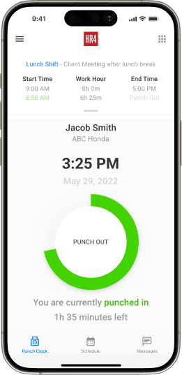
Live shift progress and remaining time
02. Punch Clock
Designed to make time tracking clear, immediate, and impossible to miss—while giving users real-time awareness of their shift.
Provided clear visibility into today’s schedule, helping users understand exactly when to clock in and out
Introduced real-time feedback (hours worked, time remaining) to support in-the-moment decisions
Added contextual safeguards, such as early/late warnings and location validation, to ensure accurate tracking without manager intervention
UX Psychology Applied
Feedback Loops
Real-time updates (time worked, remaining shift) reinforce user actions and build confidence in the system
Goal Gradient Effect
Visual progress toward shift completion motivates users to stay engaged and complete their work
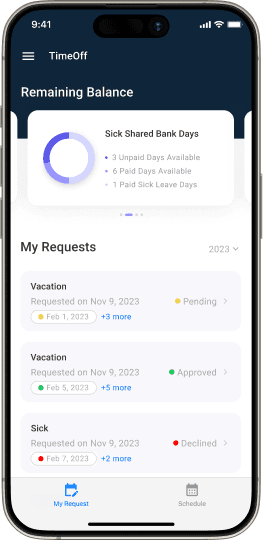
Clear history of requests and outcomes

Reduces uncertainty before submission

Simple date selection with clear context
03. Time Off
Designed to give employees clear visibility and confidence when requesting time off—by making balances, decisions, and outcomes easy to understand.
Provided real-time visibility into remaining balances, helping users make informed decisions before submitting requests
Introduced a dynamic summary that updates based on selected dates, reducing uncertainty and preventing errors
Made request history easily accessible, allowing users to track past decisions and outcomes without additional effort
UX Psychology Applied
Recognition over Recall
Key information (balances, request impact) is surfaced upfront, reducing the need to remember policies or limits
Immediate Feedback
Real-time updates during request creation help users understand consequences before submitting

Shift density at a glance

Supports transparent communication

Clear confirmation of accepted schedule
04. Schedule
Designed to give employees clear visibility into their shifts—while enabling them to confidently accept, adjust, or raise conflicts when needed.
Provided a flexible calendar view, allowing users to switch between monthly overview and weekly focus for better clarity
Visualized shift density with simple indicators, helping users quickly understand workload at a glance
Enabled direct actions (accept or report conflict), turning passive viewing into active decision-making
Reinforced commitment with confirmation states, giving users clear feedback once schedules are accepted
UX Psychology Applied
Recognition over Recall
Visual indicators and structured layouts help users quickly understand their schedule without effort
Commitment & Consistency
Accepting a schedule creates a sense of responsibility and increases follow-through

Designed to increase visibility across teams

Supports lightweight team engagement
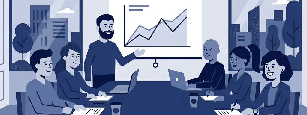
05. Week at a Glance
Designed to provide a quick, contextual overview of the week—helping employees stay informed, connected, and aware of what’s happening across the team.
Surfaced key weekly highlights such as team events, birthdays, and time off to increase visibility beyond individual tasks
Consolidated scattered information into a single, glanceable view to reduce the need for active searching
Positioned the feature as a lightweight touchpoint to promote awareness without interrupting primary workflows
UX Psychology Applied
Social Proof
Visible team activities and events reinforce a sense of belonging and encourage engagement within the organization
Recognition over Recall
Presenting relevant weekly information upfront reduces the need for users to remember or actively seek it out

Compliance progress at a glance

Step-by-step policy breakdown

Reinforces accountability and completion
06. Compliance & Learning
Designed to guide employees through required policies and training—while ensuring clear progress, completion, and accountability.
Provided a clear progress overview, allowing users to understand their compliance status at a glance
Structured content into step-by-step lessons to make complex policies easier to consume
Reinforced completion with acknowledgment and signature, turning passive reading into an active commitment
UX Psychology Applied
Goal Gradient Effect
Visible progress motivates users to complete required training
Commitment & Consistency
Acknowledgment and signature reinforce accountability and increase follow-through
CLOSING
Summary
Impact
Following the launch of the redesigned mobile experience, overall usage nearly doubled, with a significant increase in mobile engagement based on internal reporting data.
App downloads also grew substantially, indicating improved accessibility and perceived value among users.
What This Means
By shifting from a desktop-heavy system to a more action-focused mobile experience, the product became more aligned with real user behavior—enabling employees to interact with the system naturally during their workday.
Reflection
This project reinforced the importance of prioritizing real-world usage over feature completeness—designing not for what the system can do, but for what users need to do in the moment.
Key Metrics
Outcome at a glance
Overall mobile app usage
Avg. usage per app
Punch in/out usage
Other Projects

Looks like you've reached to the end!
Here are few options:
© 2025 Young Bin Hwang. All Rights Reserved.