
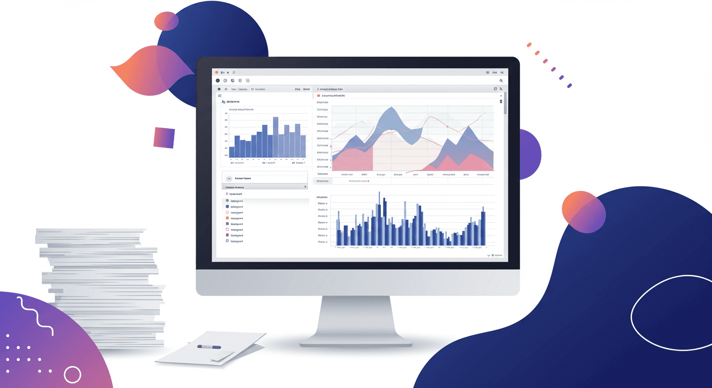
In 2021, we were requested to create a platform to enhance potential of our clients' employees and maximize their performance. I was part of an ambitious project to design a new platform called the "Recognition App" for these leading automotive brands in North America.
My Role
Behavioral Research
User Interviews
UX Design
UI Design
Quality Assurance
Tools
Figma
Photoshop
Illustrator
Visual Studio
Team
1 UX/UI Designer (me)
2 PM
4 Devs
Timeline
Feb 2022 - June 2022
Kickoff
What was the objective?
Define
Understanding the problem
At the start of the project, we had the opportunity to speak with executive members of our clients. During our discussions, we discovered that their biggest pain point was the use of paper-based and Excel systems for managing massive amounts of data across all dealerships in Canada. We identified 3 main issues that were causing frustration for the executives:

Manual Data Management
The HR team was spending a significant amount of time manually gathering data from various paper-based and Excel files at the start of each reporting period. This was a time-consuming and inefficient process.
Massive Paper-Based and Excel Data
The old system made it challenging for employees to easily track and understand the data. Additionally, there was a risk of important data getting lost or forgotten.

The Lack of Standards Fails to Encourage Better Employee Performance
With the difficulties stated above, executives lack methods that offer goals and objectives for their employees to achieve further success for the company.
(To comply with my non-disclosure agreement, I only included some of the questions)
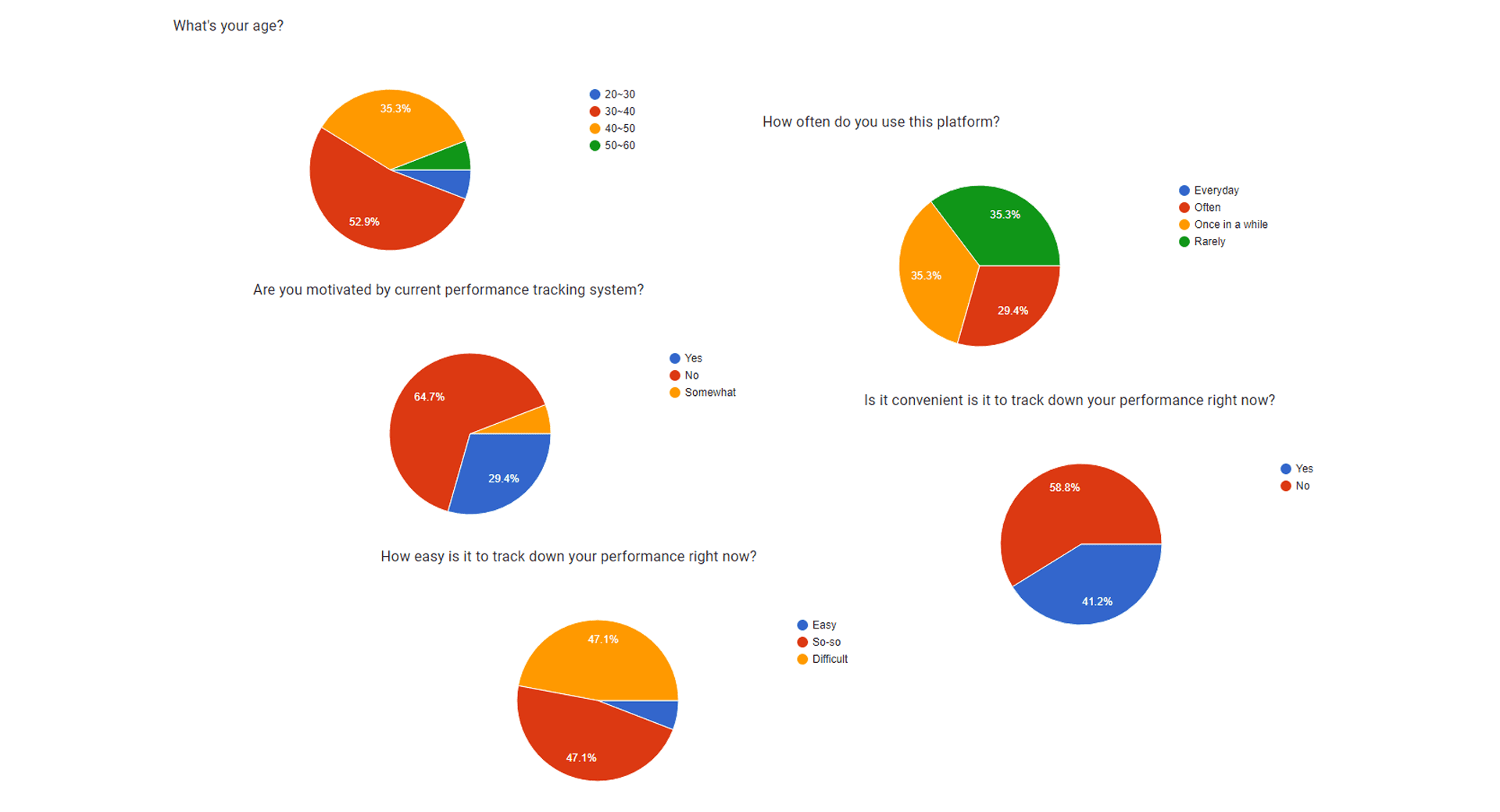
After identifying the pain points of the executive team, we proceeded to conduct quantitative research to gather feedback from staff-level employees on the current system. Our goal was to ensure that the platform we design would meet the needs of all employees, so we needed to consider the perspectives of staff-level employees.
Quantitative research revealed that a majority of staff-level employees were dissatisfied with the current system, resulting in a decrease in usage. These insights reinforced the need to design a more user-friendly and efficient platform to meet the needs of all employees.
"Last, but not the least, is performance. Feedback is important to give each employee a perspective on how he/she is doing. More importantly, the data you acquire through performance analytics allows you to assess which training or tools are needed by your workforce for them to maximize their potential."
Hacks, RJ. "How HR Analytics Boost Productivity and Profitability." Web blog post. AIHR Academy to Innovate HR. 19 April, 2017. Web. 17 April, 2022. <https://www.aihr.com/blog/hr-analytics-boost-productivity-and-profitability/>.
Develop
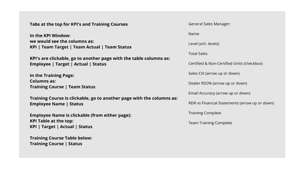
Solution & Wireframes
After identifying the clients' needs and pain points, we moved on to brainstorm specific solutions to address them. One of the key insights we gained from our quantitative and qualitative research was that staff-level employees and executives have different data needs. To address this, we developed separate screens tailored to each group's specific requirements.


Internal Team Testing
To ensure the accuracy of the data and its relevance to the automotive industry, we required a team with specialized knowledge of automotive industry structures to conduct the quality assurance testing. To this end, we engaged not only our QA team but also HR specialists and consultants from HR4 to be involved in the project.
Our usability testing focused on ensuring that we covered all mandatory data from both executive and staff-level employee perspectives.
We also aimed to determine how much the new method of displaying sales and HR data motivates employees to improve their performance.
Given that the age demographic of our client's employee population was primarily between 30 and 50 years old, it was crucial for us to ensure that the performance data is easily accessible to the employees.
Iteration
Key Finding #1
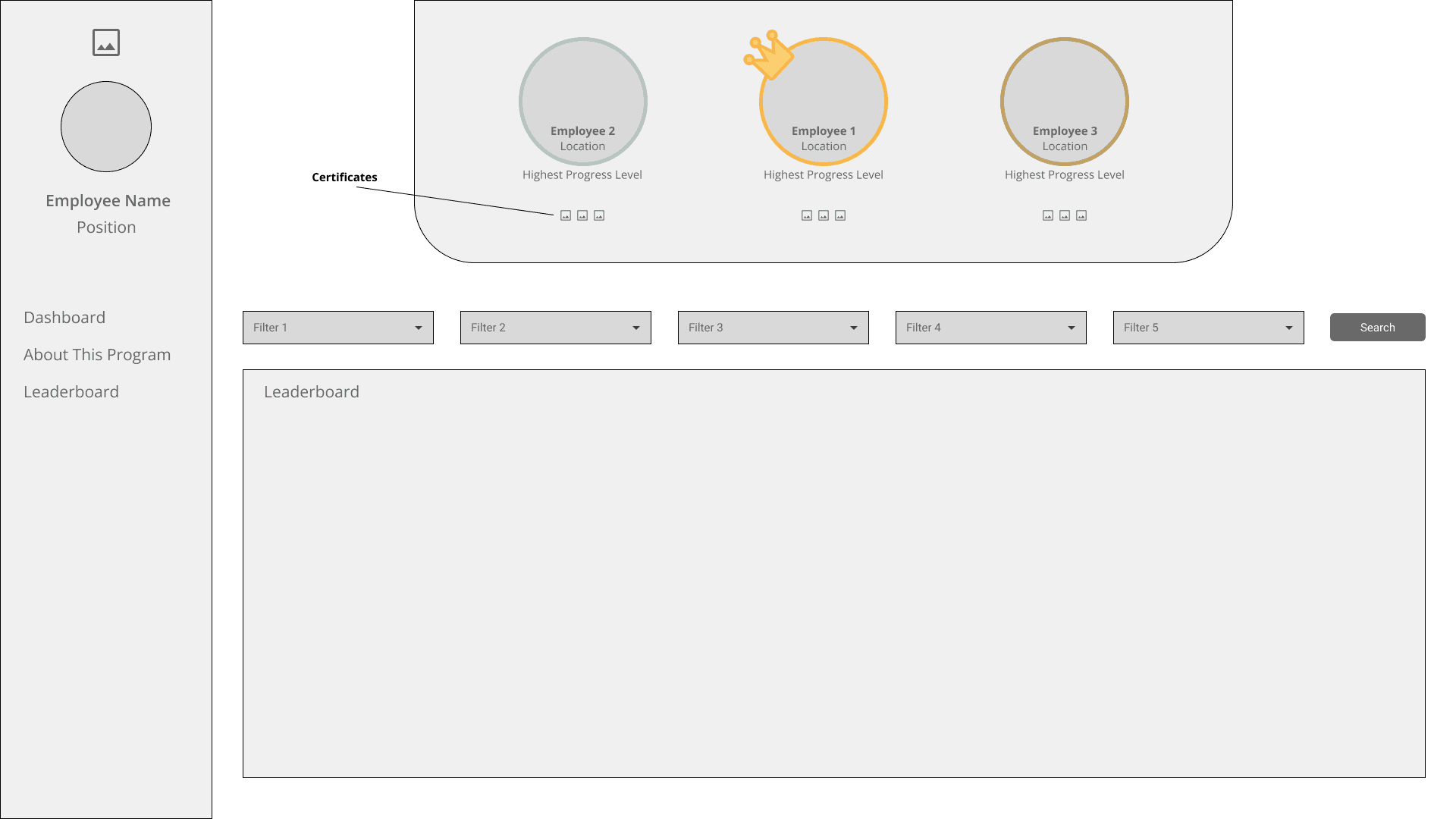
Both staff-level employees and executives prefer to have group performance highlighted, rather than individual performance. Interestingly, even those who were highlighted for their high performance expressed discomfort with the attention. They acknowledged the usefulness of the leaderboard for comparing their performance with others in a table format, but they did not want to be singled out.
Solution: Based on this feedback, we decided to provide a quick summary of employee performance grouped by performance levels, rather than highlighting individual performance
Iteration
Key Finding #2
Although we separated screens and linked them with access buttons to allow for more data in the leaderboard, users faced difficulties in navigating the datas they wanted to analyze. This revealed that our efforts to simplify the user flow for the client's age demographics were insufficient.
Solution: To accommodate users' preferences for accessing data at a glance with fewer clicks, we simplified the user flow even further by consolidating all data into a single table with horizontal scrolls.
Deliver
Final Design

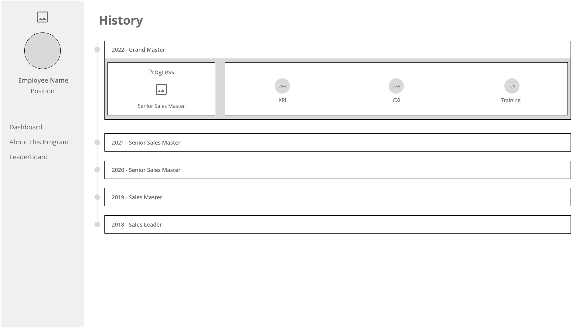
This dashboard page is designed specifically for staff-level employees. The most important part of this screen is the current status box. While the exact ranking system cannot be revealed due to NDA, we can provide some examples to help illustrate it. Each medal represents a higher rank, so the more medals displayed, the higher the employee's rank. This system allows executives to quickly identify the performance levels of their employees, and determine if rewards are needed for top-performing employees.
The ranks are determined by meeting or exceeding the standards set by our clients, such as their KPI performances. These data are displayed in the Working Towards section, located beside the current status box. Here, the KPI status is presented in a table format, along with CXI data graphs and progress updates for training courses. Users can filter these data sets by selecting one of the colored buttons.
Our solution successfully fulfills our clients' needs by providing an easy way for them to track performance and identify areas for improvement. With the rank system, executives can easily identify employee problems and move forward instantly. The purpose of the rank system will be fully explained later in the showcase.
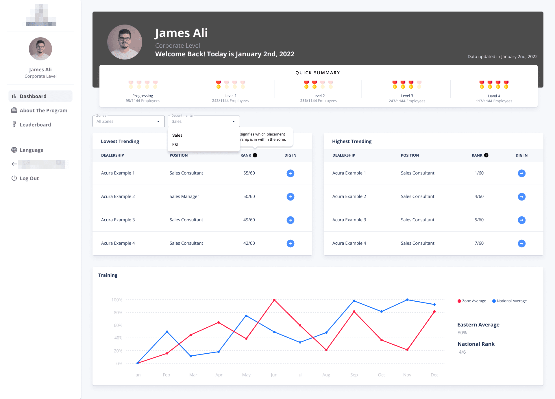
The executive member's screen is designed to meet their unique data needs, which differ significantly from those of staff-level employees. Executives require a high-level overview of the company’s overall performance, as well as detailed insights into specific zones, dealerships, and positions.
To facilitate this, we have implemented a ranking system for staff-level employees, enabling executives to quickly identify individuals who may need additional training. This data is presented in the Quick Summary section, which includes tables highlighting the highest and lowest performance trends. These insights help executives understand the factors contributing to employee or positional success or underperformance, allowing them to take targeted action.
Additionally, the final graph on this screen visualizes the training completion rate for the zone under the executive's oversight. It displays both the zone and national averages, providing a clear benchmark for executives to assess whether their team is meeting or exceeding expectations.

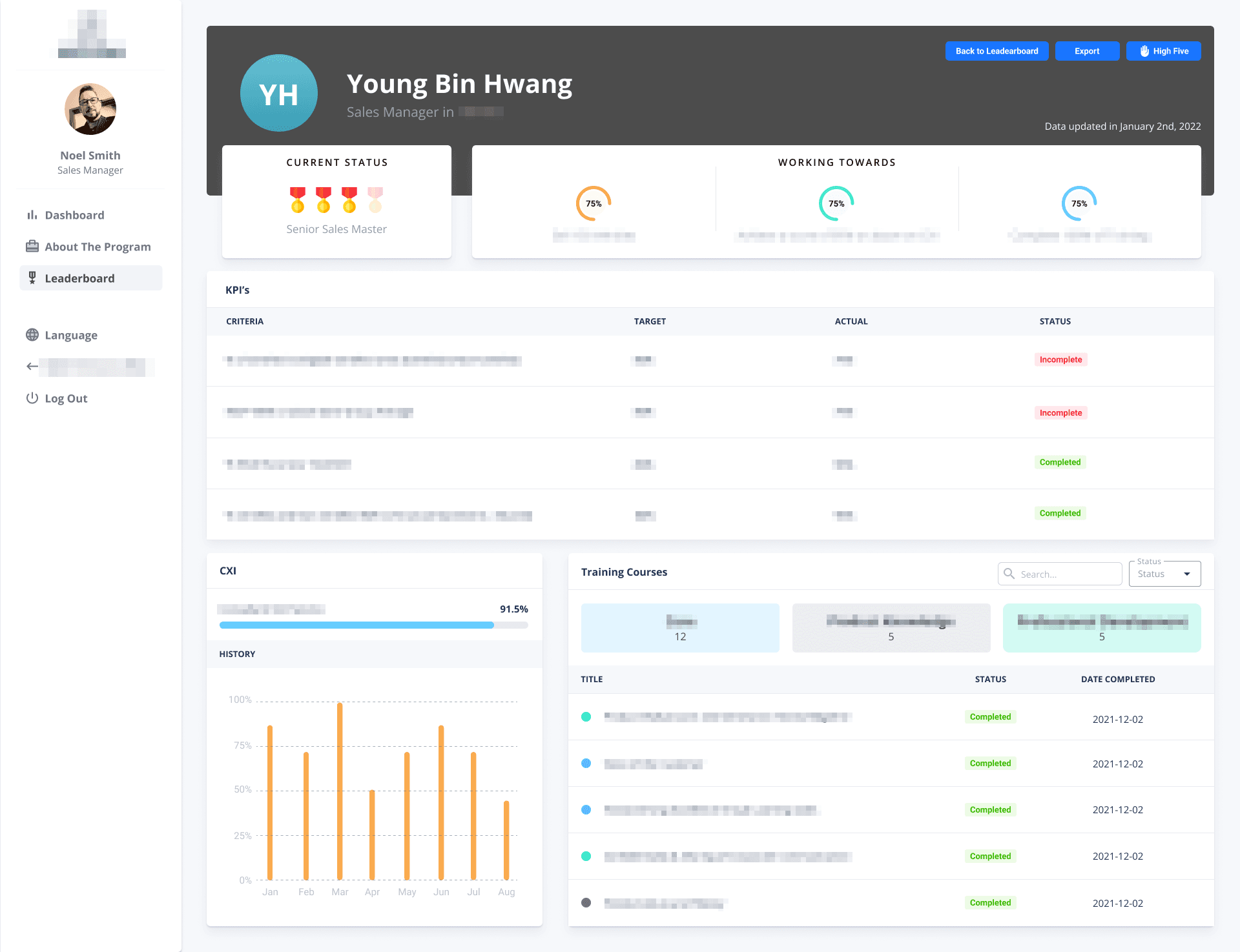
Executives and managers can access the performance data of employees they are responsible for, enabling them to identify each employee's performance level and take action accordingly. This data can be printed or exported in CSV or XLSX format. Additionally, the High Five button redirects users to the Kudos! app on the HR4 platform to send badges, providing a way to encourage and recognize outstanding performance.
Key Metrics
31%
Increase in unique visitors
11%
Increase in total logins
15%
Increase in training report view
98%
Average training completion rate for 2022
conclusion
Takeaways
One of the most significant takeaways from this project is that UX design is not a fixed concept, but rather a fluid one that can vary depending on the client. Initially, I believed that moving away from scroll design and organizing data on separate pages would provide greater clarity and specificity, as I personally viewed scroll design as outdated. However, given that our clients' age demographic fell between the ages of 30 and 50, they preferred retaining the old design. They were apprehensive about significant design changes that would require them to invest additional time and effort into adapting to a new format. This experience highlighted the importance of taking into account clients' preferences and expectations when designing a UX solution.
